Generative AI Assistant
Essentially ChatGPT for enterprise and defence use cases across DSTA, MINDEF, and SAF

CASE STUDY OVERVIEW
Designing AI interactions that guide, not confuse
In defence environments, asking the right question to the right system isn't just about efficiency—it's about trust. When users consistently entered policy queries into GAIA's Task Assistant and drafted emails in the Policies Assistant, it revealed a critical flaw: our dual-assistant model was confusing users at the most fundamental level.
🤝 In this project, I led research and iterative design across deployments, shaping AI interactions.
✅ Resulted in management buy-in and new funding to scale up for use cases across DSTA, MINDEF, and SAF.
🕒 Duration: 2024 - Present
PROJECT BACKGROUND
-
What is GAIA?
-
On-premise AI assistant for DSTA
-
-
Why does it matter?
-
Keeps sensitive defence data on-premise, enables efficient work without internet ↔️ intranet transfers
-
-
Who uses it?
-
DSTA employees across technical and non-technical roles
-

THE PROBLEM
GAIA offers two specialised assistants: Task Assistant for general workplace tasks (emails, summaries, brainstorming) and Policies Assistant for navigating DSTA's internal policies and procedures.

I observed as a defence project manager opened GAIA for the first time.
She needed to find information about a procurement policy. The interface loaded—without hesitation, she typed her policy question.
Nothing useful came back. GAIA couldn't access policy documents from the Task Assistant—the general-purpose tool.
"Hm, maybe I worded it wrong," rephrasing her query. Still nothing.
This wasn't a user error. This was a design failure.
Users consistently queried the wrong assistant. Policy questions ended up in Task Assistant, email drafts in Policies Assistant.
The result❗️: Failed queries and diminishing confidence in the AI system.
DISCOVERY & RESEARCH
To understand the scope of this problem, I conducted guerrilla testing with 6 DSTA employees. I watched them interact with GAIA, asked them to think aloud, and probed their decision-making in real-time.
Three moments during user testing revealed why navigation was failing.
Users typed wherever they landed first, without looking
I asked a participant to find information about leave policies using GAIA. She opened the interface, and within 2 seconds—before even reading the navigation labels—she'd clicked into Task Assistant and started typing.
"Why did you choose Task Assistant?"
User: "Oh... I didn't really choose. I just saw the input box and started typing. That's how ChatGPT works, right?"
The insight: Users brought learned behaviour from consumer AI tools. They expected one general chatbot, not specialised assistants.


These insights crystallised the core problem: GAIA's interface wasn't meeting users where they were.
Users came to GAIA with ChatGPT expectations—one input box, instant answers. But we'd designed a system that required them to learn a new mental model: two specialised assistants with distinct capabilities. And we weren't giving them the visual or contextual cues to build that mental model.
I brought these findings back to the product team and stakeholders.
THREE DESIGN PRINCIPLES EMERGED
1️⃣ Visual > Verbal
Users process visual distinctions faster than reading labels. We needed strong visual differentiation to signal "these are different" at a glance.
2️⃣ Context at the point of action
Descriptions couldn't be optional. Users needed to understand each assistant's purpose before they started typing.
3️⃣ Work with instinct, not against it
We couldn't eliminate the ChatGPT reflex, but we could redirect it through design that made correct navigation the path of least resistance.
RAPID PROTOTYPING & TESTING
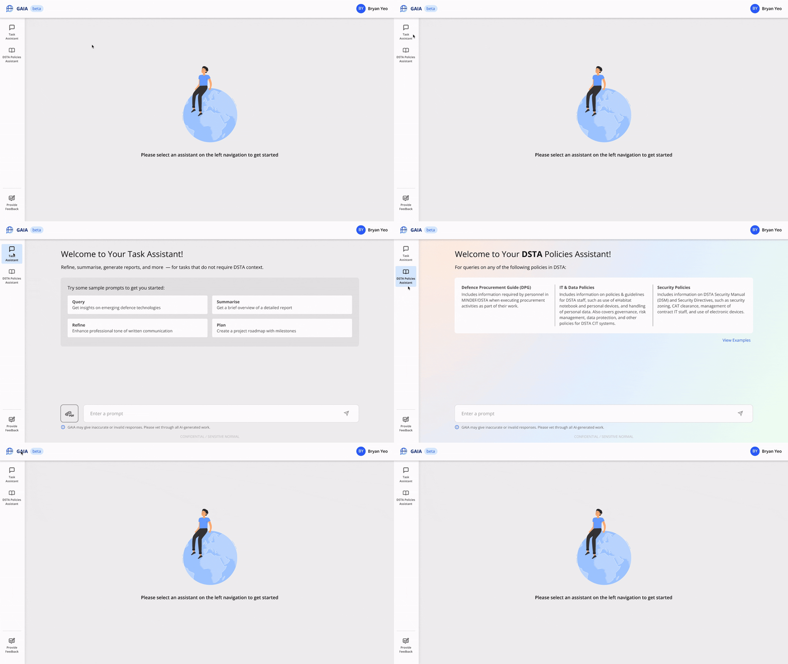
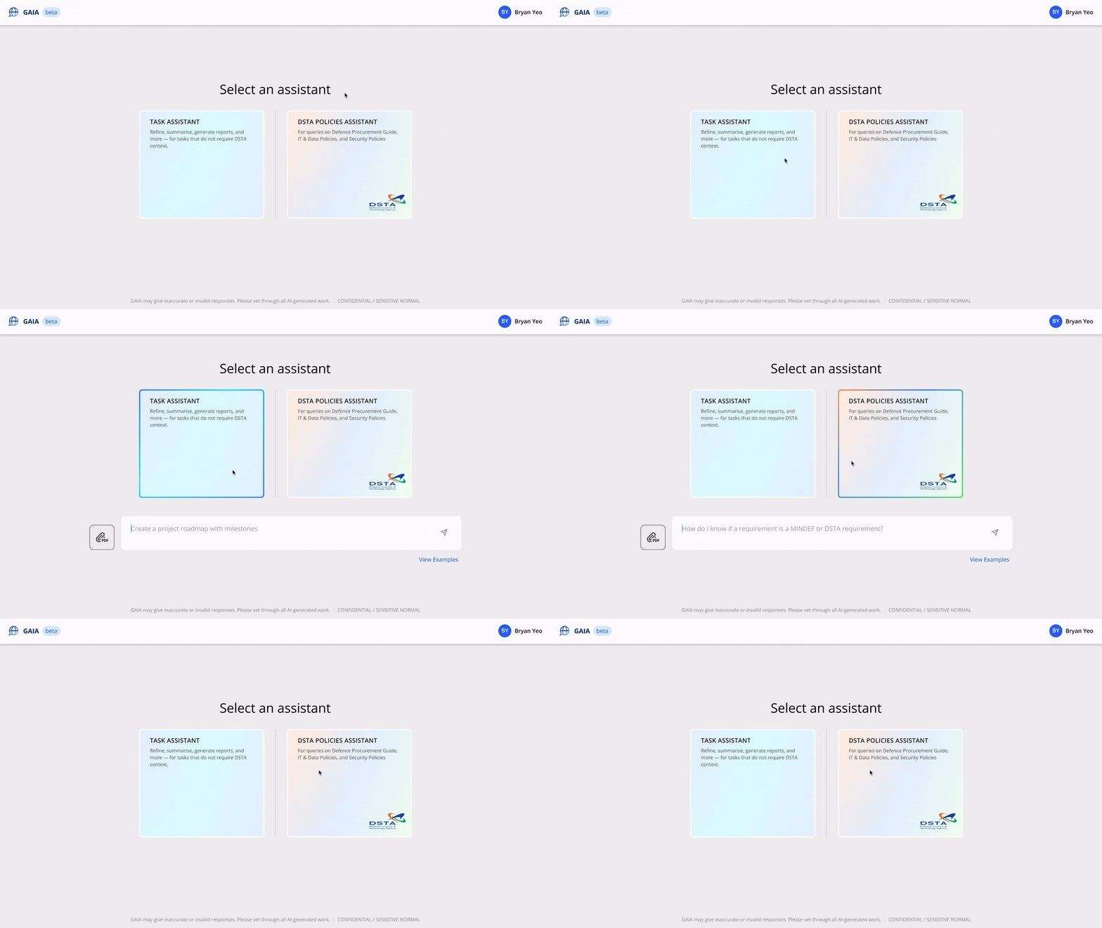
With the three design principles, I explored how to guide users toward correct navigation. I quickly prototyped four design variations, each testing different approaches to making the distinction between assistants clearer.
I conducted design critiques with 6 users to evaluate which approach best supported their understanding and decision-making.

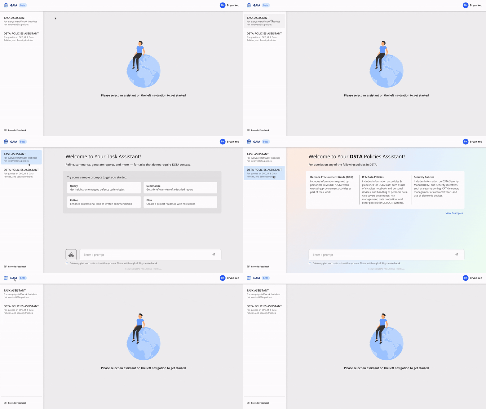
Option 2 kept the left navigation but added descriptions under each assistant name—making the distinction visible upfront. The landing page required users to select an assistant from the left navigation to get started—no immediate input box to trigger reflexive typing.
"It's clearer what things I can do in the Task Assistant because the description is already there."
4 out of 6 participants preferred this option. It provided context without adding extra steps, and the layout encouraged users to read both options before choosing.

I moved forward with Design 2 because it struck the right balance: it provided context at the point of decision, worked with familiar navigation patterns, and encouraged deliberate selection without adding friction.
For the Policies Assistant specifically, I introduced a light gradient background as a visual cue—a subtle but consistent signal that users had entered a different environment with access to policy documents.
Did it work?
After deployment, I analysed chat logs from 34 users in the two weeks before the changes and 12 users in the two weeks after.
I tracked whether the visual differentiation—particularly the background colour change in Policies Assistant—helped users navigate correctly.

✅ 13.3%
more users navigated without any errors—completing all their queries in the correct assistants. This was measured using an all-or-nothing rule (every query had to be correct), making the improvement particularly meaningful.
At the query level, accuracy increased from 94.7% to 98%—a 3.3% improvement that prevented dozens of daily mis-navigations.
The takeaway 💡: The design solution worked. More users could confidently distinguish between assistants and navigate correctly throughout their sessions.
By solving this foundational navigation problem, we created a stable base for building trust in GAIA's AI capabilities.
IMPACT
Shipped solution across DSTA, MINDEF, and SAF

The navigation improvements shipped as part of GAIA's evolution from internal testbed to cross-agency platform.
While this was one piece of a much larger effort, it addressed a fundamental user experience problem that needed to be solved for GAIA to scale.
Noticed the change in branding? Skip to view Design Evolution ✨.
GAIA's strategic expansion
GAIA's potential caught the attention of leadership across the defence sector. Demos to DSTA management, the Chief Executive, and subsequently to MINDEF and SAF agencies generated significant interest. The navigation improvements I implemented ensured GAIA was ready to scale.

This leadership buy-in secured:
-
Funding for additional manpower and resources
-
Commitment to develop new features and UX improvements
-
Deployment pathways to MINDEF and SAF organisations
GAIA's feature on The Straits Times
GAIA's impact gained public visibility when it was featured in The Straits Times, with DSTA's Chief Executive highlighting GAIA's key role in the organisation's AI strategy.
DESIGN EVOLUTION ✨
Shaping DSTA's Design Language for AI
The work on GAIA sparked a broader question: How should DSTA design AI products at scale?
This led to a new initiative—developing DSTA's design language for AI, extending the organisation-wide design system with principles and patterns specifically for AI interactions. I co-led this effort, establishing standards that would guide AI projects across DSTA.
GAIA became the proving ground. I designed the visual refresh that made it the first product to implement this new design language—elevating the interface while maintaining the foundational navigation structure that had proven successful.

REFLECTION
Designing in the age of uncertainty

My biggest takeaway: Designing for AI means navigating two types of uncertainty.
1. User-facing uncertainty: AI outputs aren't predictable. The same prompt yields different responses. Users experience this emotionally—sometimes with delight, often with doubt. Our job is to minimise uncertainty where possible, and prepare users to navigate it when we can't.
2. Designer-facing uncertainty: The AI landscape evolves daily. New models, capabilities, and interaction patterns emerge constantly. We design while learning, sometimes applying yesterday's research to today's work. This is the reality of working in an emerging field.
What I'd do differently

Build stronger influence in product decisions earlier.
Navigation was foundational, but beneath it was a deeper challenge: trust in AI outputs. I advocated for trust-building features—citations, document peeks—but these were consistently deprioritised for system stability and performance.
In hindsight, trust needed stakeholder buy-in at the product vision stage, not during the development stage when technical priorities were already locked in.


